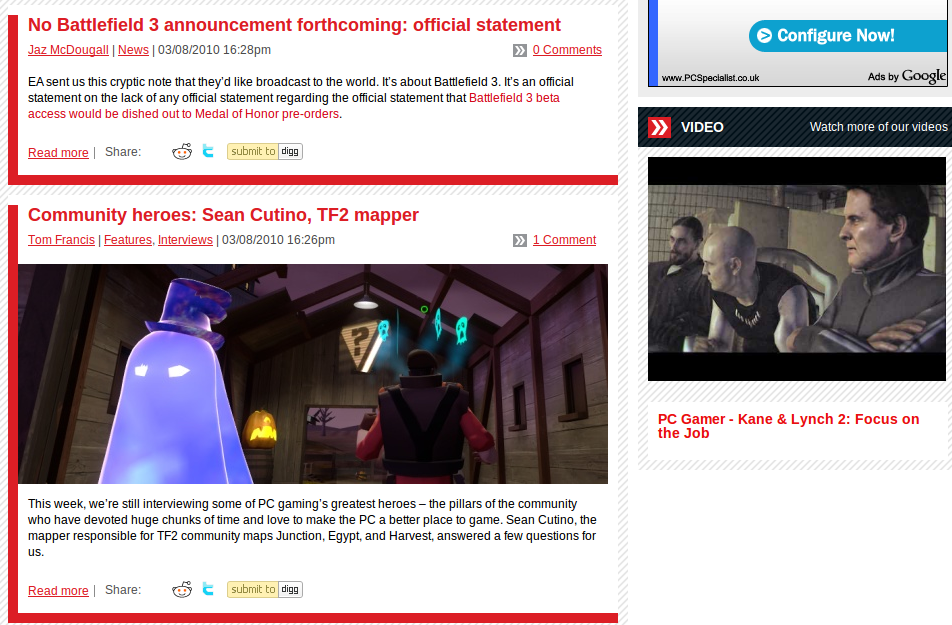
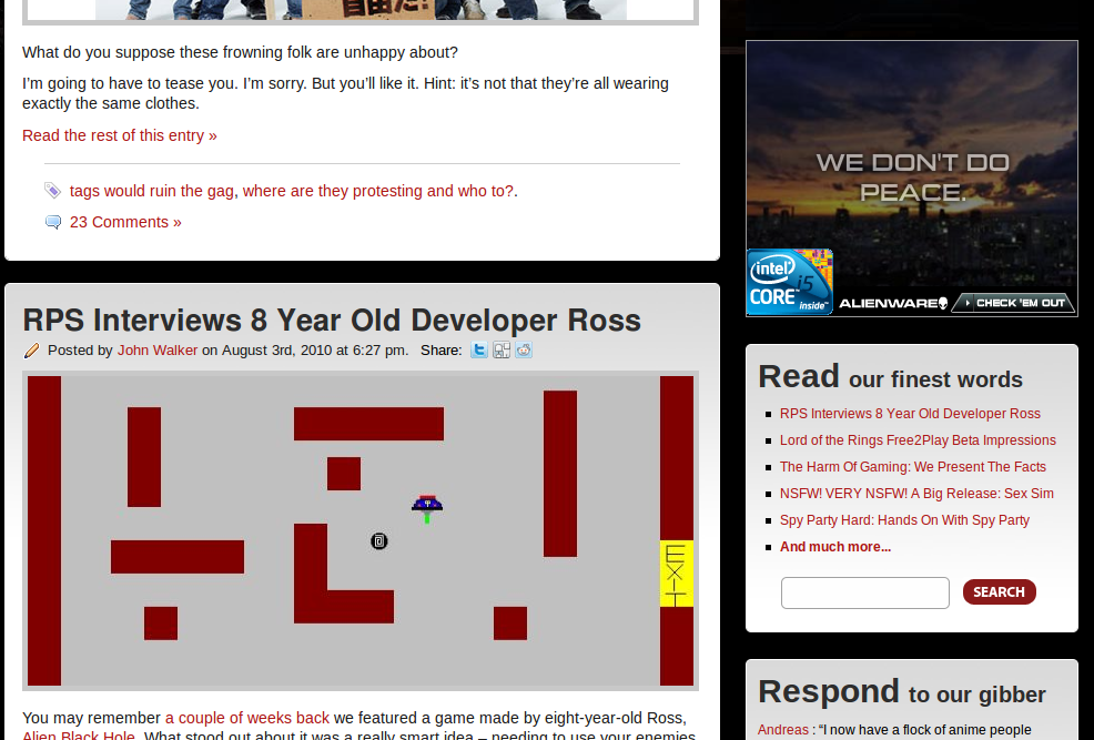
Back in June of this year, PC Gamer launched a new website. This website design appears to be a rip-off of that used by Rock Paper Shotgun. With all the images that follow, click through for a larger version.
But, let’s roll back shall we? Rock Paper Shotgun launched September 2007, though their first post goes back to July 2007. They were a novel pc gaming blog site, trying to do something different in the gaming scene. They concentrated on PC games and only PC games, with running jokes. They have a small enough set of writers, that you can pick up the personality of each. (Kieron takes the weird ones, VERY NSFW: example.)
Back in 2007, pcgamer.co.uk redirected to a sub-site of www.computerandvideogames.com. Since then, they haven’t altered the design at all. Now, it redirects to pcgamer.com. Looking at the two reveals this:


As an ex-web-developer, it looks to me like someone decided that they quite liked the RPS type website and went ‘make me a website like that, but in this style’. And tweaked the mock ups (and site designs) a few times, till what they had looks remarkably like what we see now.
Saying that, of course, this is quite a standard design style. It comes quite often easily when you use WordPress as your back-end engine, as this blog does, and as RPS does. However, they’ve not just used the site layout of wordpress as a base, they’ve decided to publish all of their posts in the same sort of format as RPS, with the same aim at getting discussions around their posts via the commenting.
A little birdie tells me that someone at future (the company behind PC gamer) really might hate Rock Paper Shotgun. Would rather they disappear. It’s almost like, they’ve finally decided to fight this sphere of influence, with money, and lots of people, finally decided that maybe their website is worth working on and taking care of.
What annoys me, is that the big guy is trying to kill the little guy 🙁
Here are a whole load of screenshots, save you finding them. Some are from Wayback machine, some are from the website directly.
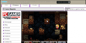
The old website, up till June. This image was recovered with a lot of hard work from webpigeon, of unitycoders.co.uk, (thanks!) since PC gamer used some really horrible website coding, which broke the waybackmachine copy. This has to be one of the ugliest websites I’ve seen, though not the worst. You could switch the big image, and below it was a list of recent stories.

And, if you scroll down a bit..:

They seem to be trying to throw links at you, lots and lots and lots of them, in a really small space. Check it out for yourself.
Rock Paper Shotgun’s footer:

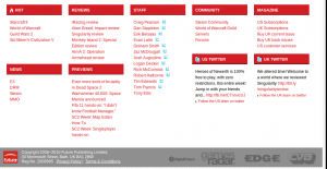
PC Gamer’s footer:

OOo… don’t they look similar? Apart from the ‘we must keep up with the cool kids’ twitter panels and lots and lots of post links (which RPS doesn’t force on you, or puts in the right hand panel). This mess could also be due to Search Engine Optimization, that dark art in which you try to trick search engines into putting you higher up on their listings than your arch rivals.
Now, I work for the company that keeps RPS online. I like the guys that work there, I think they do a good job, especially considering they’re not getting paid much from it.
Also interesting, is the fact that PC Gamer seem to have thrown money at this venture. I work with some high-load wordpress-powered sites, and there is some very obvious things you do to make them work fast. Very fast. PC Gamer isn’t doing at least one of the most obvious, which suggests that instead they’ve thrown cash at keeping it online, with a cluster of computers working on it. Don’t know how a website works? Find out here
